Truecaller: Alert feature on mobile app
How I designed a feature for Truecaller that alerts your contacts if you’re in danger
September 20, 2020 by Shkumbin
Considering the fact that this feature would be used in life-threatening conditions, the first thing that crossed my mind was that I should focus on creating the easiest and most discreet way of feature activation from the users in time of need.
When you are returning from work late at night and someone is following you and placing you in a dangerous situation, you don’t necessarily have the opportunity to unlock your phone, open Truecaller, go into a setting somewhere and then finally send the emergency message to your contacts. This type of activation path would take too long and render the feature completely useless.
I did some brainstorming and research on a number of possible activation paths and I came to the conclusion that using physical buttons is the most accessible way to activate the emergency mode since you don’t even need to look at your phone to activate it as just tapping in a rapid motion the power button multiple times would give us the signal to send the pre-defined SOS message.

To my amusement, I found out that in Android it would be possible to tap and listen into the physical buttons and we can even configure how many times the user needs to push the power button and the rate of the taps which was a delight as it would allow us to fully accommodate this service into our use case.
But then I found out that Apple doesn’t allow such accessibility service which was an immediate buzz-kill. So for iOS, I decided to go with the next best thing – 3D touch. Using a 3D touch shortcut in the home screen, the user would be able to activate the SOS service in fewer steps rather than having to launch the whole app.
So the good news was that we could use the most convenient activation path via the power button in Android, which in Truecaller’s case would serve the majority of the user base, and for the iOS platform, we would still have a way of implementing the SOS service, although less ideal.
With that in mind, I started the design process.
General Concept and Wireframing
I used the user story map to build a sitemap for the feature with the functions for both the sender and the recipient. I also used the sitemap to establish the flow through all the views. While considering factors such as the users mental and physical state and decreased mobility when they need to activate the feature, I made sure that the design is minimal and the choices to be straightforward without any cognitive load, so principles like progressive disclosure and Hicks law have been applied during the design process.

After the sitemap, I completed the skeletal framework of the design and after a set of rough sketches, I made final designs for all screens.
The language and presentation such as labels, icons etc. has been chosen in a way that everyone can easily interpret them without any further thought.
Iconography
Since the icon of a feature is the first thing that a user notices, I consider that iconography is the most important UX design process as with a tiny square image you can either make a killer feature or completely ruin it by making it unnoticeable and dull.
Therefore, I iterated through a number of different feature icons where I tried to visualize the features value proposition by theming it after emergency services, SOS, helplines, themes that the user has already a mental image of, while still blending in with the rest of the Truecaller’s iconography and platform-specific guidelines.

I decided to pick Lifebuoy as the final icon since everyone knows about the importance and role of such a life-saving device. Based on a report by RedCross, more than half of the US population don’t know basic swimming skills, therefore, choosing an iconography that represents lifeguards and help would definitely send home the message about what our SOS feature offers.
Accessing & introduction of the feature
I decided to use the settings page for iOS and navigation drawer for Android to place the SOS feature icon. There the user will be able to enable or disable the feature, setup emergency contacts, set the access pin, etc.

As for the feature introduction, in Android, it should be implemented using the bottom sheet, and as a card message for iOS users. The introduction would be shown during one of the app startups & we can do something smart about it: Targeting.

While it’s true that this feature would be useful for everyone either in case of emergency, danger, health issues, there are a number of people that need it most including women, youth, elders, people living in high crime areas, dangerous zones. In collaboration with the analytics teams, since we probably have the gender, age, location of our users inside analytics, we can purposely target these groups of people and market this feature specifically to them. This way we don’t just spam everyone with dialogs and popups, but send it to only people that would get the most out of it.
Onboarding & Setup
As soon as the user clicks on the Continue button or the icon after the feature is presented, the onboarding process begins. The first screen describes the way to use the feature and how the emergency contacts will be notified. The second screen will be used to setup your emergency contacts, add new contacts, remove them, etc.
After the user selects the emergency contacts, the feature is ready to be used, in iOS the 3D Touch shortcut is enabled, in Android we start listening to the power button input presses.

Activation
Communication is so critical in such kind of situations, it has to be precise and clear for the users on what actions have to take. Therefore, during the design process, I have taken into account factors like color, size and position in order to prioritize the information and increase the accessibility.
Principles like Fitt’s law have been considered when deciding the position, size and other attributes of the CTA’s to ensure better accessibility.

During the research that I have done, I found out that about 30% of the emergency calls on similar apps were made accidentally by pocket dialing, were wrongly initiated etc, so in order to stop these false activations, the emergency mode uses specific gestures for activation. In iOS the SOS message is activated using a 3D Touch shortcut, while in Android it is activated by clicking the power button five times repeatedly.
Canceling SOS Mode
After the SOS mode is activated, there should be a way for the user to deactivate the message for reasons including triggering it by mistake, just testing the feature out, or the emergency is no longer valid.
If the user activates the feature by mistake, they will have a 10-second window to cancel before the actual message is sent, this way giving them enough time to act and not disturb their contacts.
Canceling the SOS Mode after it is activated should be protected with a PIN code in order to prevent unauthorized cancelation by their attacker or someone else.
Delivery
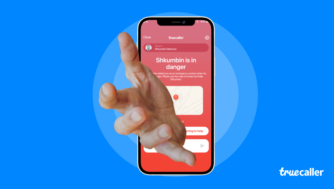
10 seconds after the SOS mode is activated, the user’s phone alerts all emergency contacts with a Flash message. These flash messages contain the users current location, and, as long as the SOS mode is active, it sends updates to the emergency contacts when the location changes. Flash messages should be used since we can include more detailed information and even overwrite the Do Not Disturb, Silent sound modes in the phones of emergency contacts so when they receive an SOS message, they actually notice it.

But if the user does not have an internet connection or none of the emergency contacts read the flash messages within 1 minute, they will receive an SMS with the same text and location included as a link.
Visual Design
I decided on a bright red as a main color with a supporting secondary color of faded red that I transformed into a linear gradient. I added a few tertiary colors to color-code sections and match the rest of the app design. I sourced icons that matched the tone of the product and added those to the design system.
I also used the standard fonts for both platforms, San Francisco for iOS and Roboto for Android.
