Relto: An apartment rating platform
Designed to help tenants identify how well landlords maintain their properties…
October 14, 2021 by Shkumbin
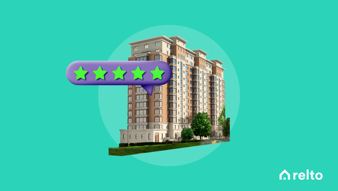
Relto (initially was called Rentify) is a platform designed to help tenants identify how well landlords maintain their properties before they sign a lease. Each score that is put on a building is the result of both, background checks and the reviews of the past tenants.
Created for all tenants and landlords on NYC area.
UX Research, UX Design, and Visual Design
In 2018, there were just over a million rental households in NYC and people that were looking for apartments had little information on the unit and neighborhood they were planning to move to. Even though the information was out there, up until then there wasn’t a platform that included all info in one single place.
Research
When trying to answer the question “what do the tenants need?” I focused on those who are directly involved in the market. By reaching out to those around me who currently live in a rental property, I wanted to determine what people value the most when finding a new place to live in
I was surprised to find that more than 85% of people were using Zillow to find new rental places. That helped me narrow down the audience and target group.
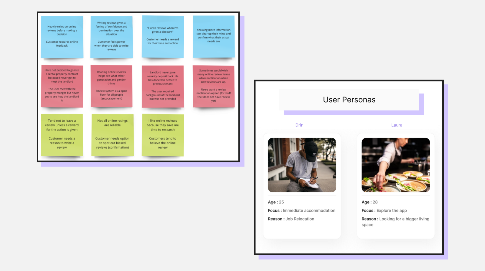
In doing this research, I separated the groups by ages, and within each group, I separated them again by the years they lived in rental property. My research participants were very diverse, which helped shape the app better. With the findings and the interviews I have conducted, I was able to create a few user personas that would match the target audience.
Challenges
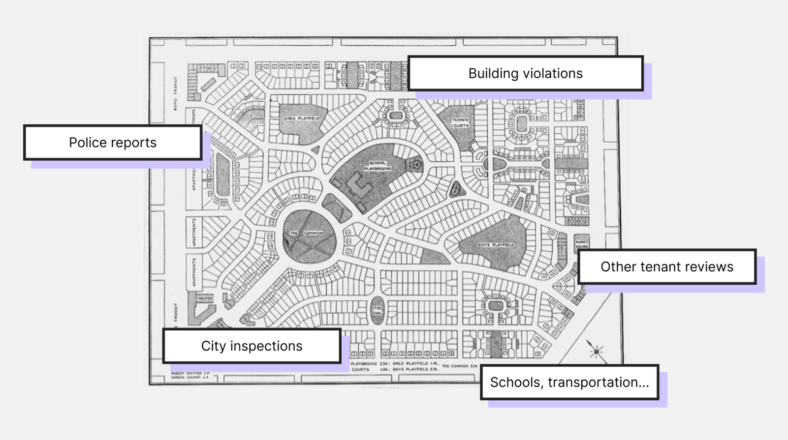
One unique finding, during research, was that quite a number of users think that the online ratings are biased, and thus they don’t trust the ratings fully. From the findings, I realized the platform shouldn’t just be about rating but should also be an informing tool that gathers data from multiple sources like physical inspections, violations, open data from the NY City, transport lines, schools nearby etc.
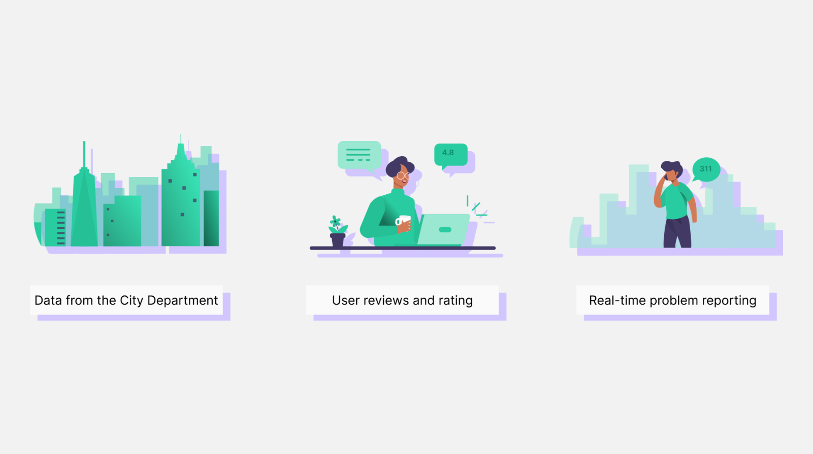
Working closely with the dev team I had to make sure that all of these data points could be continuously imported and displayed using their APIs. After having that sorted, I started the user experience.
In my design process, I first like to get my thoughts and ideas down on paper. I brainstorm ideas on what the actual design can look like. In this case, I started sketching some wireframes to get an idea of how I want the information architecture to look like. After getting an idea on that, I then transitioned into doing digital user journey maps and I ended up with the first version of high fidelity design including the color palette, illustrations and imagery.
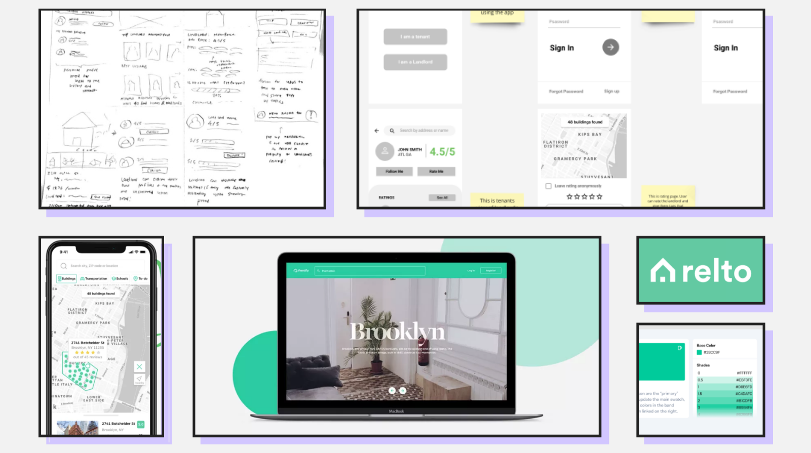
The design was continuously monitored from all of the stakeholders involved in the project and once we were all happy with the version, it was ready for the usability testing.
Usability and Feedback
Through the usability study, I realized there are at least two major findings that, once added, would significantly improve the platform and make it ready to hit the market:
1 . Considering that the building units and addresses were all imported from open data of the city, there were no images of the building units or area. Users wanted a visual representation of the building instead of an icon, so again, working with the awesome dev team we had at the time, we were able to find a way to capture an image from the google street view and use that as an image for the building unit.
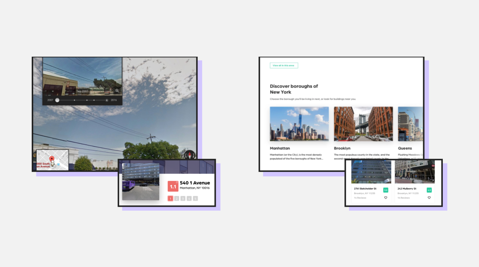
2 . We had to add a featured apartment section on the homepage because the platform was lacking suggestions and people who are still on the very first steps of finding a rental place don’t necessarily know what they are looking for.
This platform is still being used by tenants and landlords who like to improve the rate of their apartment. Since then it became available on App Store and Google Play to reach more people who tend to use mobile apps more.

