Working with Samsung for a while now, helped me become familiar with its UI/UX design to the point that I started learning users behavior around product listing pages and was able to notice what was missing and what changes needed to be made. After our team of designers and strategists at Sogody analyzed the UX design that the website had at that time, we came up with a few recommendations for the Cheil CRO team, and what we could do to improve the users’ experience.
Samsung: Product Cards Optimization
Working with Samsung for a while now, helped me become familiar with its UI/UX design
September 21, 2021 by Shkumbin
The hypotheses
Having in mind what people want to engage with when purchasing domestic appliance products, the main changing point was to add the Grid v List View. Thus far, the website had only the Grid option of browsing the product range. This option was available for both, new and returning users.
From my observation, this could impact the ROI in the long-run, and why is that? Because new users are discovering the marketplace. Meaning they’re only browsing with three key areas of focus: image, price, and dimensions. Whereas returning users are looking to purchase, which implies that they’re more interested in the details such as: specifications, ways to buy/finance, benefits of the eShop, USPs, etc.

Therefore, content should be surfaced to best drive engagement/conversion for each audience group. Which would then translate to increased ROI and a better user experience. In conclusion to this, I highlighted some additional CX/UX optimization test opportunities to improve web hygiene.
The analysis process
After getting these recommendations, the Data & Analytics Team conducted an analysis to get the data on how new and returning visitors engaged with the current website. They decided to use SEG – Fridges & Freezers as an example for generating insights on Germany’s market. This market was chosen so we could be able to implement ContentSquare to distinguish new vs returning user interaction, meanwhile Fridges and Freezers were chosen to act as a microcosm for the wider Domestic Appliances product range.
The results showed that the differences in page engagement between new and returning users was minimal. (This is partially due to the UX of the site meaning all users were being served the same content.) Even though the new users are browsing, and the returning users are looking to purchase, the UX didn’t meet their needs to engage with the website in the way they wanted but instead forced the same behaviour for both audiences.
Implementing the changes
Having the data and the information from the analytics team allowed me to start the process of making the necessary changes to the layout. I broke down six opportunities of how these initial areas could be changed.
Opportunity 1: Personalize product information for new users and returning users
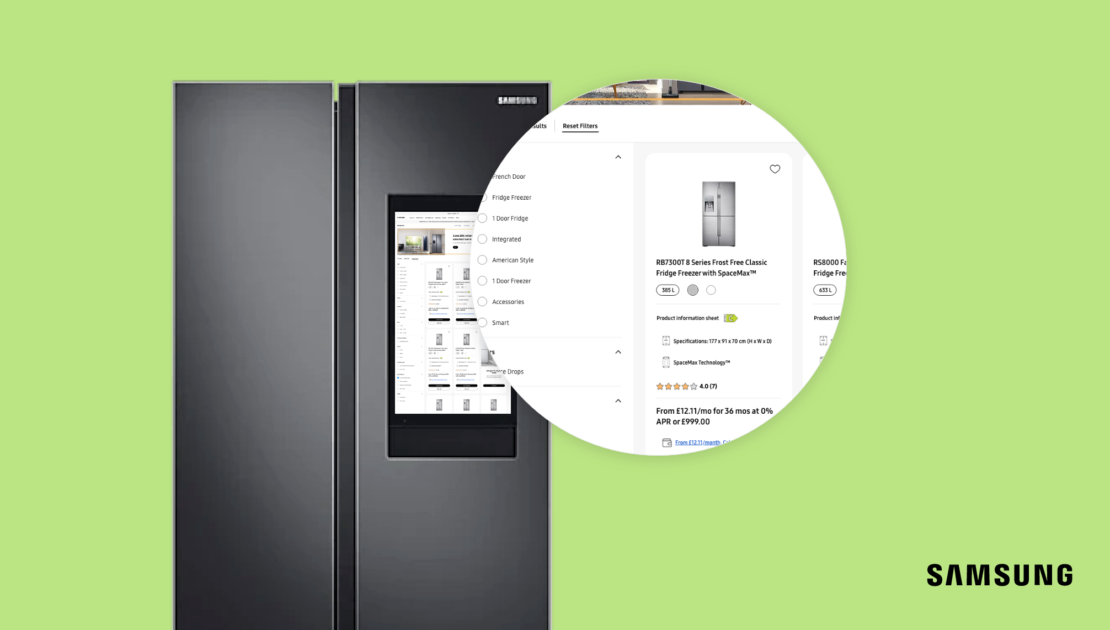
I started the process by giving users the option to switch between list and grid view, that way we would ease their browsing journey and help them find the desired product quicker. So I designed, for both mobile and desktop of the Product Finder Page (PFP), a new element that allows users to switch between the two views. The goal was to make the best of list view and grid view, and to not put an equal amount of information on them. Otherwise the grid view would end up too long and we would lose the value of having both views available.

I created a design where the new users can see reduced information/specs via the grid view, and the returning users can see the increased details. In addition, I also reviewed the designs of the promotional banners in-between product grids and provided an alternative for when the Product Finder Page is viewed as a list.
Opportunity 2: Provide a greater product variation in PFP page
According to our data, the engagement with products decreases rapidly when scrolling down the page. Having this in mind, I switched the design into making the top products to stand out when the users visit the landing page. As such, when landing on the page for “All Fridges and Freezers” the users would be able to see products that are more beneficial for them first.
Opportunity 3: Remove non-engagement opportunities
By personalising the product cards according to the new/returning segment, we ensured that each segment could see the required information to help them progress with their journey. To enrich their journey we worked on other details as well. Our research showed that 8 of the 9 products only came in one colour. There is no need to have the option to pick between colours for the products that didn’t have options the user could pick from, so I removed non-engagement opportunities.

Furthermore, 7 of the 9 products had not reviews and 1 of the 9 have only a 3* review. These were acting as detracting features, so I changed the UX and made these “options” not visible when unengageable/unfavourable
Opportunity 4: Provide more of the product specs (dimensions) in the PFP
Contrary to not showing the non-engagement “options”, we had to provide more of the product specs (dimensions) in the PFP page. Across both new and returning users, customers show deeper interests in the product specifications. This is backed up with users engaging with the energy efficiency links. For all white goods, all users want to know: What can I afford? What does it look like? Can it fit in my house/design?

Opportunity 5: Implement a gallery feature when hovering over the image on the PFP
Returning users then want to know the greater benefits of each product. Enabling customers to browse the product range with a horizontal view exposed some of the key information more effectively for each product. Also, users are all interested in viewing all of the product imagery.
So, I implemented a gallery feature when hovering over the image on the Product Finder Page. All this would improve the overall customers’ browsing experience and drive them to purchase it directly from eCOM.
Opportunity 6: Give the design choice to the customer (Grid or List View)
All these changes were made so we could give the design choice to the customer, so they could decide their own layout, meaning the users now can pick the layout best suited for their needs.
The end results
After implementing all these changes the test went live. From 25th of January until 25th of March, we collected data on how the users were responding to the made changes. After analysing the data, we concluded that:
Returned users responded well to the optimisations with both an uplift in CVR and CTR to Product Detail Page (PDP) – Return users were ready to conclude.
First time users were 30% more likely to interact with ‘More info’ CTA than ‘Buy now’
First time users only started to respond well when once both ‘More info’ CTA had been added and ‘Buy now’ CTA directed users through to PDP – Perhaps ‘Buy now’ CTAs should direct users through to PDP on other PFPs or for Mobile users.
We continued to monitor the performance from the 25th of March for another week. After the test continued to perform well, we then pushed all changes to 100% for all users. In the end, the overall results ( from 25th of January to 30th of March) were as it follows:
- +5.35% uplift in order conversion, from 1.58% to 1.67%
- +7.6% uplift in checkout conversion from 2.07% to 2.23%.
- Decline in click through rate to PDP of -0.8%, from 46.8% to 46.5%

